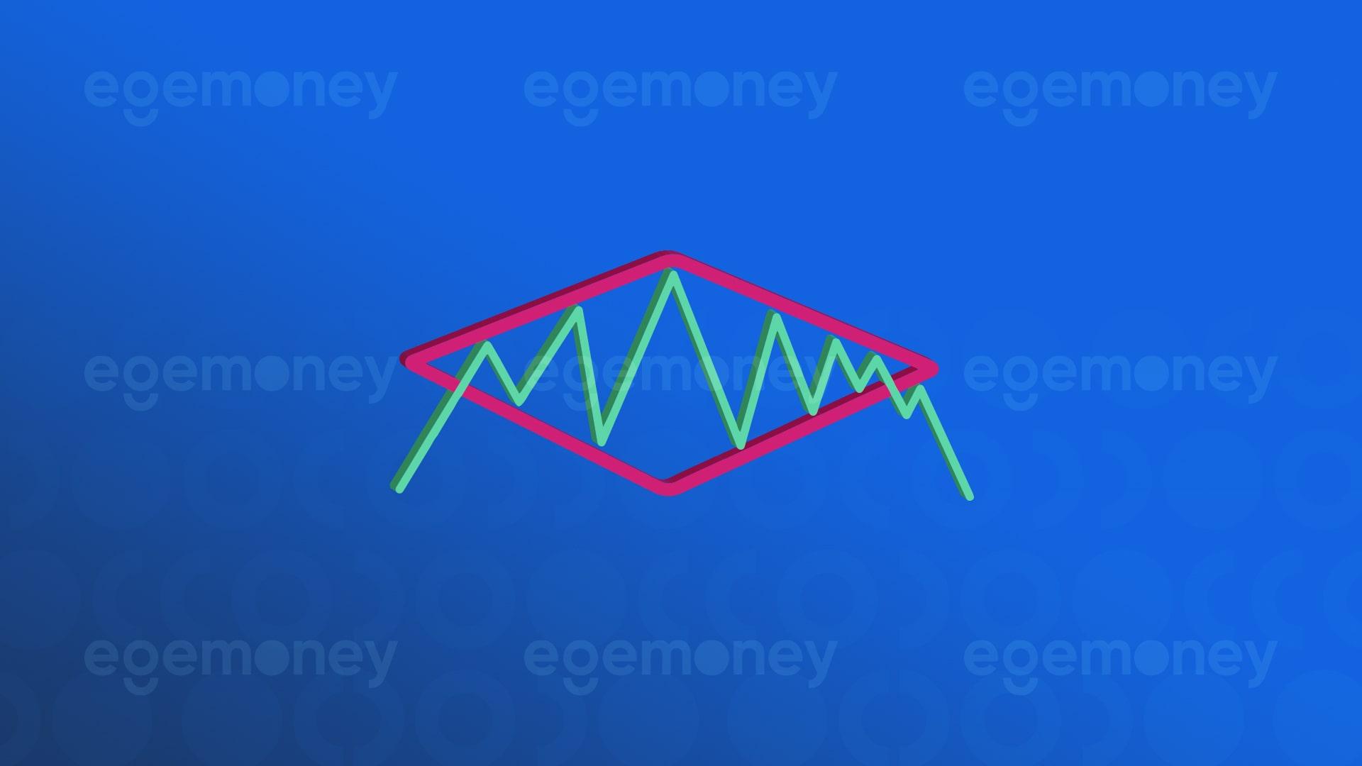

The diamond chart pattern is a technical analysis method widely used in financial markets. This pattern is especially used to identify reversal signals in price trends in cryptocurrency, stocks, forex, and commodity markets. The key characteristic of the diamond chart pattern is the distinct diamond shape that forms on the price chart. This pattern typically occurs at the end of a trend and signals that prices are likely to transition into a new trend.
What Is the Diamond Chart Pattern?
The diamond chart pattern is a significant chart pattern frequently used in technical analysis. This pattern often indicates that after a period of high volatility (price fluctuations) in the market, prices start to consolidate within a narrow range. For investors and analysts, this is considered a sign that the market may change direction. The diamond chart pattern typically appears at either the peak or trough of the market and signals a reversal of the current trend. When observed at the end of an uptrend, it suggests a downtrend, and when seen at the end of a downtrend, it suggests an uptrend.
The formation of the diamond chart pattern begins with price fluctuations within a wide range, indicating that market participants have different opinions and are moving in uncertainty. Later on, prices start moving within a narrower range, indicating that market participants are starting to reach a consensus. The completion of the pattern occurs when prices break out of this narrow range and initiate a new trend.
How to Trade the Diamond Chart Pattern?
Detection of the Pattern: Firstly, you need to identify the diamond chart pattern on the chart. This pattern is typically seen as a diamond shape characterized by price expansion and contraction, often occurring at the peak or trough of a trend.
Volume Indicators: It’s important to examine the volume during the formation of the diamond chart pattern. High volume at the beginning of the pattern and decreasing volume toward the end can be significant indicators of the pattern’s validity.
Waiting for the Breakout Point: Once the pattern is complete, you should wait for prices to break out of the pattern. This breakout point is referred to as the “breakout point” and signifies an opportune time for trading.
Trading Direction and Targets: If the pattern occurs at a peak and prices break downward, this often signals an opportunity to open a short position. Conversely, if the pattern occurs at a trough and prices break upward, it may signal an opportunity for a long position.
Stop-Loss and Take-Profit Levels: As with any trade, risk management is crucial when trading based on the diamond chart pattern. Setting stop-loss and take-profit levels is important to minimize potential losses and protect profits.
What is Bullish Diamond Pattern?
Bullish diamond pattern, an important technical analysis model, signals a potential market reversal from bearish to bullish. It forms after a strong price decline and is characterized by a unique diamond shape created by two upper resistance levels and two lower support levels. This pattern is a valuable tool for traders, signaling a change in market momentum and providing a strategic entry point for bullish positions. You can examine an example of a bullish diamond pattern in the image below.
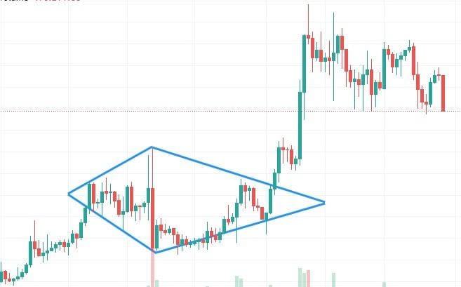
It forms within an uptrend, usually at the bottom points of the trend. After the formation is complete, the rise continues. This increase is generally expected to be as wide as the formation. It provides investors with a future target, but is rarely seen.
What is Bearish Diamond Pattern?
Bearish diamond pattern is a chart formation used in technical analysis to anticipate potential declines in market trends. It appears as a diamond shape on price charts and typically emerges at the end of an uptrend, signaling a potential shift to a downtrend. This pattern is identified initially by the formation of an expanding pattern followed by the creation of a symmetrical triangle; these two shapes together form a diamond-like pattern. The pattern is confirmed when the price breaks out below the bottom of the diamond chart pattern, indicating that sellers are gaining control over the market. Investors often interpret the bearish diamond pattern as a signal that the current uptrend is weakening, and a new downtrend may be starting, using it as an indication to consider selling assets or taking short positions. You can examine an example of a bearish diamond pattern below.
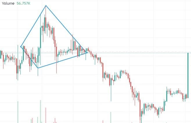
It forms within a downtrend. After the formation is complete, the decline continues. It usually occurs at the peak points of the trend. The targeted profit-taking level is a decrease equivalent to the width of the formation.
Comparison of Diamond Chart Pattern and Other Chart Patterns
When compared to other chart formations used in technical analysis, the diamond chart pattern is a reversal pattern typically seen at market peaks and bottoms.
Diamond Chart Pattern – Head and Shoulders Formation
The diamond chart pattern and the “Head and Shoulders” formation are both chart patterns used in technical analysis to help identify potential trend reversals in price movements, but each has its own unique characteristics and signifies different market psychology.
Head and Shoulders Formation: This pattern is typically observed at the end of an uptrend and signals a shift to a downtrend. The formation consists of three peaks, with a left shoulder, a higher peak in the middle (head), and a second shoulder on the right. The completion of the formation occurs when the price falls below a support level called the “neckline.” This indicates the end of the uptrend and the beginning of a downtrend.
Diamond chart pattern: This formation can be found in both bullish (Bullish Diamond) and bearish (Bearish Diamond) trends. The diamond chart pattern typically appears at the peak of a trend and indicates a trend reversal. The formation is formed by the consolidation of an expanding pattern (often a symmetrical triangle) followed by a contraction in price range. Bullish Diamond Pattern signals an uptrend following a downtrend, while Bearish Diamond Pattern signals a downtrend following an uptrend.
Connections:
- Both formations reflect changes in market psychology and the balance between buyers and sellers.
- Both patterns are used to identify trend reversals: Head and Shoulders often indicate a shift from an uptrend to a downtrend, while the diamond chart pattern can signal a reversal in both uptrends and downtrends.
- Both patterns require the completion of a specific formation followed by a breakout of a support or resistance level: In Head and Shoulders, this is the “neckline,” and in the diamond chart pattern, it’s the boundaries of the diamond.
Diamond Chart Pattern – MACD (Moving Average Convergence Divergence)
MACD (Moving Average Convergence Divergence) and the diamond chart pattern are two different tools used in technical analysis, each with its own method of evaluating market movements.
Function: MACD is used to understand the current momentum and trend direction of the market, while the diamond chart pattern is primarily used to identify trend reversals at price peaks.^
Usage: MACD is more commonly used to track short-term price movements and trend changes, whereas the diamond chart pattern is used to observe larger price movements and potential trend reversals.
Visualization: MACD provides an indicator-based approach, while the diamond chart pattern relies on pattern recognition and chart analysis.
Application: MACD can be used for quick and frequent trading decisions, while the diamond chart pattern is employed for more strategic and longer-term decisions.
For more detailed information on trending indicators, please refer to “What Are the Best Trend Indicators?“
Reliability and Limitations of the Diamond Chart Pattern
While the diamond chart pattern can be a useful tool for identifying market reversals, like any technical analysis method, it has limitations. Proper recognition and interpretation of the formation are crucial. Additionally, the diamond chart pattern does not always provide a reliable reversal signal and can be deceptive. Therefore, using volume data and other technical indicators for confirmation of the formation is recommended.
Volume Analysis and Its Importance in the Diamond Chart Pattern
Volume analysis plays a critical role in diagnosing and confirming the diamond chart pattern. Typically, at the beginning of the formation, there is often high volume, which decreases during the contraction phase of the formation. An increase in volume is expected at the breakout point of the formation. These volume changes indicate the strength or weakness of the formation and provide investors with a better idea for making trading decisions.
The information presented in this article is for general informational purposes and does not constitute any investment advice. Readers are advised to conduct their own research and consult a professional financial advisor before making financial decisions.