
ITB (IntoTheBlock) QuickView Analytics is a crypto prediction method developed with a machine learning algorithm. You can easily access the “general” information of any crypto asset you are interested in by using this feature under the ITB Analysis heading. All you should do is know how to read the graphs and signals/prediction charts you see.
ITB Analytics is divided into two sections: Quick View and Predictions. In this article, we will explain how to access and use EgeMoney QuickView charts.
How To Access EgeMoney QuickView Charts?
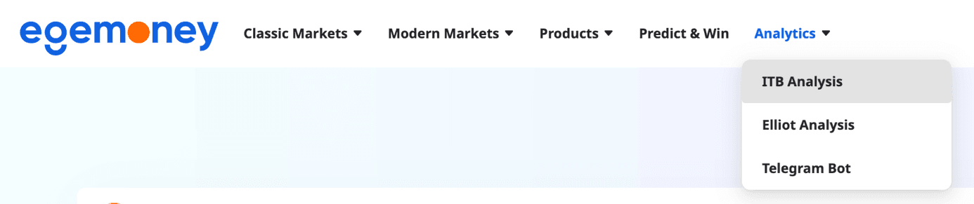 For the QuickView page in EgeMoney ITB Analysis, when you come to the “Analytics” heading in the menu on the website, you must click the “ITB Analysis” button.
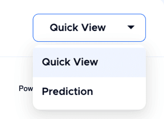 When you click on Quick View from the menu at the top right of the page, you will see the charts of this analysis method.
In the menu on the left, you will see the currency unit of each cryptocurrency, whose analysis and chart you can see. This menu contains all cryptocurrencies whose data is available in our system and which you can access.
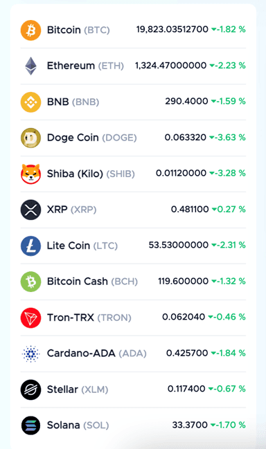 If you want to access the analysis of which cryptocurrency, simply click on that currency. For example, you can click on BTC for Bitcoin and ETH for Ethereum. The data of the unit you clicked will appear on a chart.
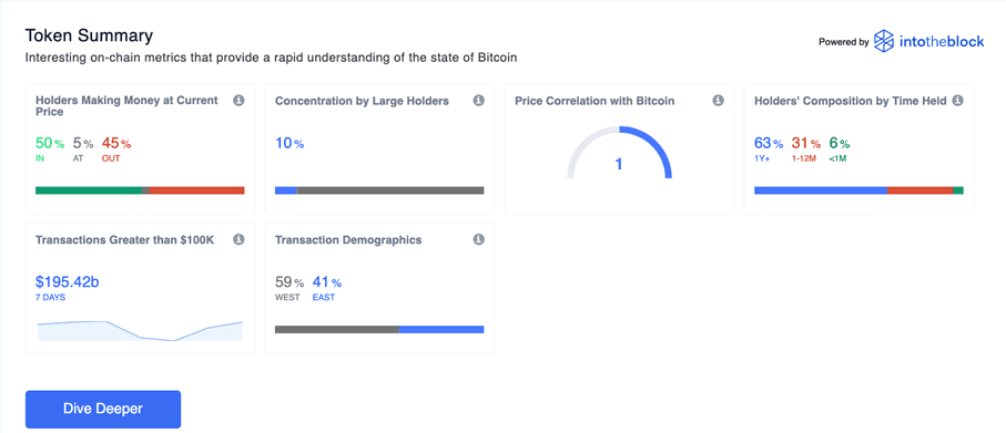 This top chart gives you a brief summary. The information you see here consists of general summaries of a cryptocurrency. The box you see at the top of the chart contains an analysis of the market price. For any address with a balance of tokens, ITB identifies the average cost at which those tokens were purchased and compares it to current price. If Current Price > Average Cost, address is “In the Money.” If Current Price < Average Cost, address is “Out of the Money”.
The second box indicates the total stocks of whales and investors. Whales are addresses that own more than 1% of the circulating supply and investors are addresses that own between 0.1% and 1% of the circulating supply.
The third box gives the 30-day price correlation with Bitcoin as described in the title. Correlation refers to changes that occur simultaneously. If the other coin you are interested in is also increasing when Bitcoin goes up, there is a positive correlation. We can come across this situation in our daily life as well. For example, the more social a person is, the more friends they have. The relationship between a person’s sociability and the number of friends is a positive correlation. Naturally, when you examine this section, you will understand whether the crypto asset you are interested in has a linear relationship with Bitcoin.
The fourth box gives the classification of addresses according to the average holding period. You can read the percentages of more than 1 year, 1-12 months and less than 1 month, respectively.
The fifth, that is, the first box in the second row; Shows the number of transactions of your chosen coin, each worth $100,000 or more. When you hover over the linear graph here, you can see the times. The number of transactions is actually the statistical state of how many people prefer your preferred crypto asset for large volume transactions.
The 6th and last box is the transaction demographic. In this box, you’ll see the percentage of people all around the world trading in what time frame.
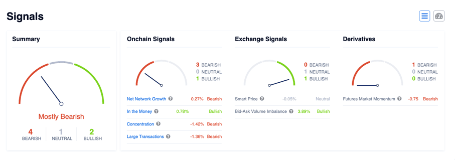 When you scroll down to the first chart, you’ll see different charts starting with “Signals” title. You can read this section in two different ways from the two different buttons at the top right. The first is in list form as above, while the second works as an indicator:
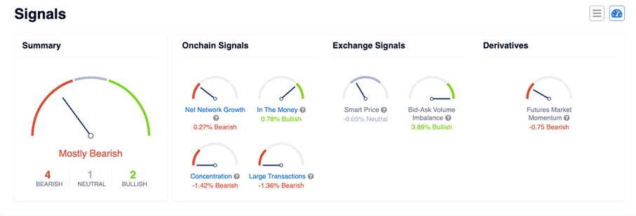 There are signals in this section that you need to read. There are four different groupings: Bear-Bull indicator, On-Chain Signals, Crypto Exchange Signals and Crypto Derivatives Signals. Likewise, every time you change your chosen coin and timeframe, the data and signals here also change as well.
On-Chain Signals: Shows Net Network Growth, In The Money, Concentration and Large Transactions Volume.
Crypto Exchange Signals: Shows Smart Price and Bid-Ask Volume Imbalance.
Crypto Derivatives Signals: Shows future market momentum.
In these readings, you should also be familiar with the terms “Bearish” and “Bullish” in signals. A rapid rise in prices in a particular financial market indicates the start of the Bull season. On the contrary, it is known that the “Bear” season begins when there is a significant decrease. In this case; These concepts you see on the signals chart actually indicate the course of the markets.
If you want to learn more about QuickView Analytics, you can contact us, or you can access the data you want more easily by using our Telegram Bot.
for more information, visit our blog page.